
A full design process walkthrough
The Prompt
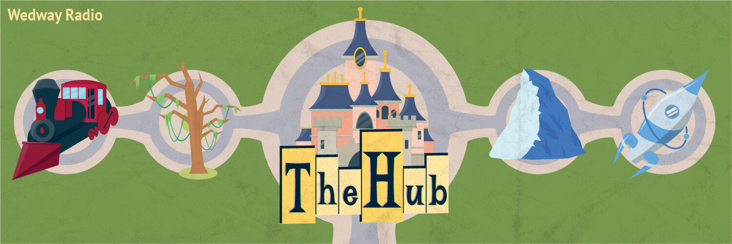
The Hub is a podcast all about the Disney theme parks. Hosts Matt and Nate discuss park attractions, tourism info, the history of the parks, and more. In addition to being the namesake of the show, “the hub” refers to the physical area at the center of Disney’s Magic Kingdom. That was the focal point for the design prompt.
I was tasked with creating a 1400x1400 pixel illustration incorporating the hub with spokes that extended out into visual representations of various Disney parks. Initially the illustrations were to represent retro Tomorrowland, Frontierland, Adventureland, and Liberty Square, though this shifted somewhat during the design process.
The Process
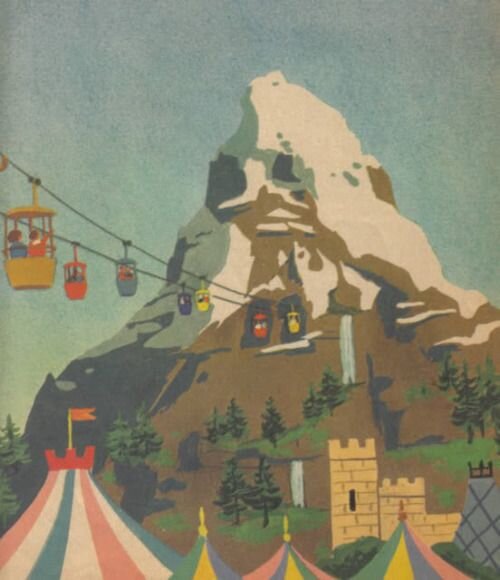
The client initially provided me with some inspirational images to give me an idea of the art direction. They wanted a bright retro mid-century feel.


Right away I wanted to make sure the general layout in my mind was what the client wanted. I put together a very basic layout with text and a rough concept for the text and hub design.

After some discussion and some adjustments to the prompt we decided what each smaller illustration would be.
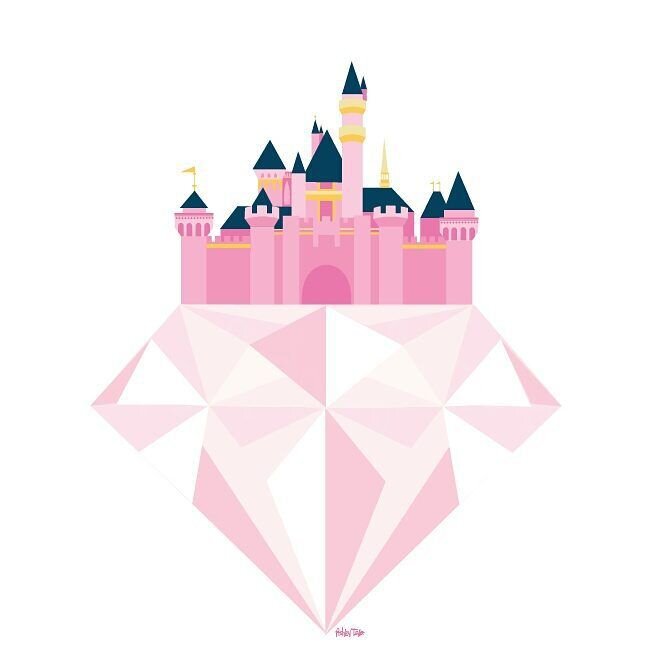
Castle (Magic Kingdom)
Mountain (Matterhorn)
Rocket (Tomorrowland)
Tree (Adventureland)
Train (Frontierland)
My first goal was to get one of the illustrations to a relatively final state to show to the client. After that the following elements could follow the aesthetic of that initial illustration. I had a good idea of what the rocket could look like, so I chose to illustrate it first.
In addition to the inspiration the client provided I put together a mood board to help determine the visual direction.

This was the first illustration I showed the client. The feedback was very positive, so I continued with the other elements.

At this point the process had a very straightforward direction: Illustrate the remaining elements in the same style as the first.
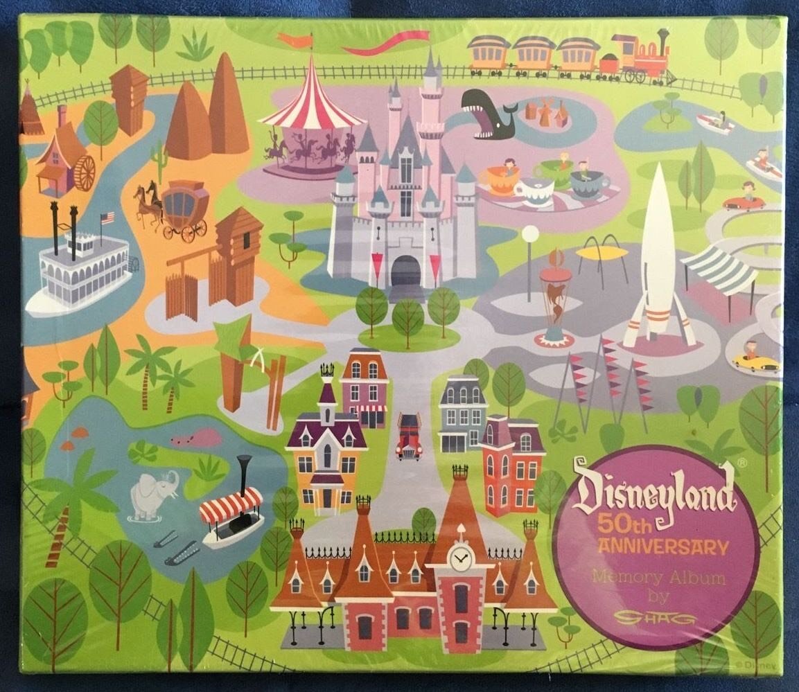
Once all of the illustrations were complete it was time to finalize the sign. In addition the client wanted to rethink the layout. They wanted the sign to be closer to the center without losing the hub as a focal point. After some trial and error we also determined the lighter green grassy color was not and the spokes of the hub would not be necessary with the new direction in layout.

Final assets
In addition to the 1400x1400 pixel illustration the commission included formatting for various social media platforms. Instagram and Twitter profile images are sometimes displayed as a circle. For this reason I removed all of the outer elements, as they would have been awkwardly cut off when displayed as a circle. I also made wider formats for YouTube and Twitter banner images, as well as a transparent background image for a YouTube video watermark.
Twitter banner

YouTube Banner

Instagram and Twitter Profile

YouTube watermark
Reviewing my work
After a project I always like to evaluate to find at least one aspect I can improve on in the future. Although the client and I agreed that the hub spokes were unnecessary for the final illustration, I do feel there could have been an extra touch to make the outer elements feel more connected to the overall composition. I did end up adding this for the wider format social media banner images, but did not find a good way to accomplish the same effect in the square image without feeling cramped.
Overall I am very pleased with how the project turned out. It was a joy to work back and forth with the client, and they were incredibly happy with the results.